Monday, 31 December 2018

Practical Outcome Visual Mock ups


A very rough guide to aid my drawing

Gathering imagery from tribal ideals of masculinity (spear holding hand), Western ideals (body building, hairy & muscly body), and Chinese masculinity ideals (the head Confucius, a representative of Wen principle: literary & scholarly pursuits).

Sketching 


Having the first and last slide as this I feel confident I've conveyed a message about the state of toxic masculinity, highlighted through the imperfectness of the scanned background and the incomplete sketch, this being drawn as the slides go on I feel is a metaphor alluding to the fact that masculinity itself is a social construction, much like the fact that the drawing is only there because I am drawing it, I am creating it on the page where there was nothing, much like the way societies have constructed something out of thin air. Furthermore the hand drawn feel I think will cut through the ever increasing rise of clean digital design. This trend is so samey, whereas a more handmade approach I feel will not only stand out, but bring things back to a more personal level, connecting with people on a deeper level as it will hopefully visually stick with them, especially with an audience of Millennials who have become so accustom to digital animation.


After visualising the story board I have a lot clearer direction and feel able to start drawing as this is going to be a lengthly process. 

Drawing


(Excuse the poor quality due to the effect when taking pictures of a light box apparently)

I've ordered my own light box so I can continue this during the evenings as I know this will take up some time, luckily I find drawing very therapeutic! I'm using layout paper to draw all the frames on, which enables me to trace and adjust the image by centimetres each time, creating a stop motion animation effect.


Tuesday, 11 December 2018

Animation: Drawing process complete!


Having finished the initial drawing process, I can now review how to adapt it so it's more obvious what its about, from the feedback I received at the last peer crit, they were confused on the subject matter which makes sense as it seems to just be a strange man with multiple limbs falling off...

Reviewing the feedback I got I want to make an audio track to better explain the topic, furthermore giving context visually ties in with my essay title which I will do through use of different backgrounds behind the animation. I want to include colour theory so black, symbolising little boys in Chinese culture and blues in Western and so on, as well as different cultural ideals of masculinity that I have explored in my essay, literary and scholarly pursuits, physical prowess and aggression.

The audio track is similarly going to link my research more to my practical, I plan to take samples from the films I've written about (Die Hard and Enter The Dragon) as well as music from Elvis and Jagger. 

I'm really pleased with the fluidity of the animation so far and quality of drawings, it's a step up in terms of accuracy thanks to using fine liner. Previously I've used black biro as I've always been so used to drawing with it but in order to colour digitally which I've only recently started doing it makes sense to have cleaner more defined lines. It furthermore doesn't smudge at all which is useful as I am very prone to being clumsy.

Thursday, 29 November 2018

Visual Research


Lynx's "Is it ok for guys..." Campaign shows masculinity in todays society, a new generation of man who wears pink, shows his emotions, be a virgin, experiment with guys and so forth. The tagline it ends with being "Is it okay to be yourself?" typed into a google search bar, I find this really powerful especially for the Millennial generation, who relies a lot on the internet as a diagnosis for their illnesses, an information point and general agony aunt, through fear of actually opening up to other people.

Lynx's audience targets young men, which is perfect as they seek to educate about a new age of masculinity, a man can do all these things. Throughout the video there are serious notes for example "Is it okay to be depressed", alongside more light hearted humorous anecdotes "Is it okay for me to be the little spoon?" I want to harness this use of humour in my visual outcome, as I feel often people especially of my generation, would rather watch a funny viral video than one with dark or serious undertones.

I feel the crudeness (increasingly large phallic imagery) in my animation is justified and will appeal to a Millennial audience, as a funny video, the serious undertones are more accessible and light hearted.


CALM campaign 84 I actually looked into for last years cop, it's as relevant as I'm also looking at how social media platforms can boost awareness. The striking heart-wrenching visual of the sculptures is a perfect example of how the visual is so much stronger than words.

CALM's other campaign #ChangeThePicture proves how the visual and written communicate well together, furthermore trying to deconstruct this facade of perfect lives on social media.


Colour theory suggests that in China black is the colour for little boys, in Western circles black is more representative of darkness, death and something sinister. It seems only right therefore that black is used as the contrast to the bright vibrant imagery alongside it, this stark visual symbolism speaks volumes as the images juxtapose the text so much. 


Delving more into colour theory, for the essay I want to compare film posters. The first being Die Hard (1988), a hollywood hit starring Bruce Willis who embodies the perfect Western man, harnessing ideals of masculinity through his physical and mental strength, he plays the aggressive hero. Contrasting this is Enter the Dragon, this is actually part aWestern film where Bruce Lee is made to be more 'appealing' to a Western audience, as it was produced by Hong Kong and American cinema. Director Robert Clouse attempts to "kick the strut out of Lee", alluding to a dilution of culture, the film furthermore combines martial arts cinema with an emerging sub genre 'Blaxploitation':

"Blaxploitation or blacksploitation is an ethnic subgenre of the exploitation film that emerged in the United States during the early 1970s. The films, though receiving backlash for stereotypical characters, are among the first in which black characters and communities are the heroes and subjects of film and television, rather than sidekicks or victims of brutality. The genre's inception coincides with the rethinking of race relations in the 1970s." 
[https://en.wikipedia.org/wiki/Blaxploitation]

It's interesting how culturally the men are placed, the black 'stud' character goes with many women and doesn't survive until the end while the Chinese character has the 'strut' taken out of him to appeal to Western audiences while the white male protagonist goes with the white women who is in charge.

Thursday, 22 November 2018

COP practical feedback


Overall the group crit was really positive, they seemed to really like my idea, thinking it was different, a little weird but amusing. I wanted to further find out wether the blatant crudeness was necessary and wether some people may find it offensive.

Is it offensive?

audience will take it different ways, those who are sensitive may do but it is not overall offensive, it's definitely more humorous. 


Do you think it's clear it relates to masculinity / toxic masculinity?

not specifically but this isn't a negative
add statement at beginning/end OR make sure that the audio track relates message clearly 


I will...

think about adding a title sequence including facts
experiment with hand drawn type for the titles 
experiment with coloured background as opposed to colouring in every frame
consider audio - sound samples discussing masculinity- use old advert samples, e.g "man up" "man enough" etc

I'm currently more drawn to the idea of utilising audio as I feel adding titles will distract from the power of the visual imagery, plus with audio it will become a more well rounded sensory experience. I plan to take audio samples from old advertisements and create an audio track much like I did in my first year COP for the Body Dysmorphia video, where I used 1950s ads to get my point across. This will be even more fitting to use old ads as it will highlight the construction of masculinity is an age old phenomena, from the teachings of Wen-Wu in China and the pressure applied by the patriarchy for men to conform to such ideals.


Monday, 5 November 2018

Practical Outcome Visual Research

Confucious: Icon of the Wen principle representing literary and scholarly pursuits.

As my outcome is to be a hand drawn-animation, this will take a considerable amount of time so I need to get drawing as soon as I have set out as storyboard and have my visual mood-boards. Here to start of is one of King Wen, King Wu and Confucious (icon of the Wen principle representing literary and scholarly pursuits).

Normally my animations take weeks or months excluding research and planning, so I plan to have this simplified in terms of content, I'd rather the message and quality be to a higher standard regardless of how much this shortens the piece, the detailing particularly on the Chinese drawings and clothes I want to stand out, contrasting the Western ideals with bulky hairy men. 

Chinese masculinity Visuals:

I'm in love with the sculpture of Confucious that looks like it's bathing, I could extend this as a metaphor for drowning in toxic masculinity, social pressure quite literally suffocating men as they feel unable to discuss their emotions.

Weaponry 


I want to include another form of masculine ideal which has historically championed physical prowess, this being of tribesmen. Whilst researching my essay I found a section in Kam Louie's Chinese Masculinities in a Globalising World discussing different cultures masculine initiation ceremonies, from the Westen public school boy's slightly violent or even sexual initiations which usually was soothed with copious amounts of alcohol, proving you're "a man". Different cultures obviously have different, arguably more worthy initiation tactics surrounding actual survival tactics such as diving for fish, capturing prey for the rest of the tribe. This image of an Indonesian tribe highlights the use of weaponry as an extension of manliness, a tool to enhance their physical threat. It seemed only right this should be included as a hint to weaponry aiding manliness, this also applies to American men owning guns or 'roadmen' with knives, they all use weapons to signify dominance

Western masculinity visuals:


Examples from Baywatch, Mick Jagger to Elvis. The latter I feature in my essay in quotes commenting on the switch of masculinity through the 50's onwards, as men become sexualised. 

Tribal Tattoos 

I also want to include tattoos, especially tribal tattoos. This introduces cultural appropriation as the latter image shows a Westernised version of traditional tribal tattoos which have historical cultural significance. 

The concept of the animation being that the cultural clashes are too intense to the point the 'masculine monster' dies supports this idea then, as the tribal tattoo ink gradually spreads and morphs it's a metaphorical representation of the dilution of cultural significance, as the rest of the world often appropriate sacred meanings, for the sake of fashion and aesthetic. 

155 Best Tribal Tattoo Designs and Meanings ̢ܠ TattooZZa
Arm Tribal Tattoos For Men 01


Video Research


Looking into masculinity in a visual sense, animated characters throughout Disney films have reinforced this toxic masculinity which is bound to stick with us as a child, we may not notice it but from a young age we've been exposed to masculine and sexist ideals.

Everything from the power men have over sexualised women, to the desired physical embodiment of man is shown. Men are shown to gain power from physical dominance over other men and have to fight for the woman, who again is more of a trophy won over by the most masculine. Other male body types featured in Disney films highlight a kind of heirachy, those without a muscly physique are less important characters, taken less seriously and will never 'get the girl'.

I want to incorporate this stereotypically masculine physique for the Western part of the 'masculine man'. Like a monster, this 'masculine man' will have different body parts directly representing different cultures masculine ideals. 

Artist Research for Masculine Monster animation 


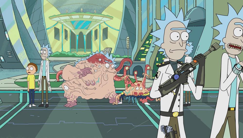
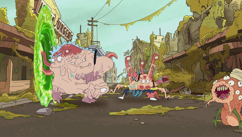
Cronenberg Rick and Morty animated characters from the popular cartoon Rick and Morty illustrated by James McDermott

Merging different bodies, different alien species results in Cronenberg creatures, I want to create a fused monster that embodies multiple different identities, different cultural ideals represented visually through body parts much like this alien monster only mine will not be able to sustain itself as it's ever changing.

The simple line drawings work well as you can see veins and folds of skin, it would be easier for me to adopt this style as opposed to my usual sketchy style with lots of shading, it will increase smooth transitions especially with something as detailed as I plan to have it as I want to incorporate many different limbs, weapons etc.


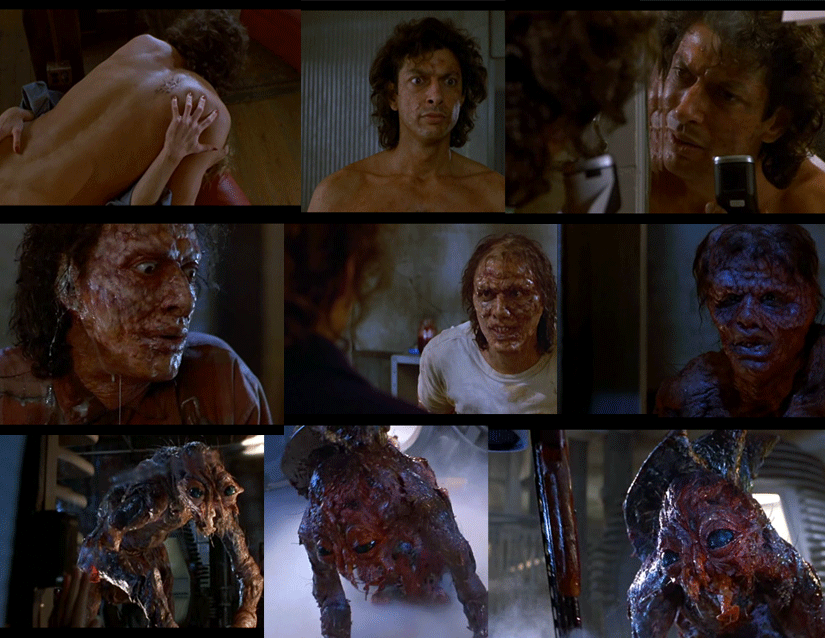
The Fly directed by David Cronenberg 

Rick and Morty's Cronenberg people were named after this director, as a homage to the first director in the horror genre who played on people's fear of bodily mutations. I've always been fascinated in horror and not easily put off with gore or.. mutations. 

The fly is a ridiculous film, it's a laughable concept which I enjoy, I want to inject a hint of humour to keep people's attention as often on social media people are prone to avoid serious or sad things, I know I do rightly or wrongly just scroll until I reach the funny feel good videos. Through the contortion of the fallic imagery I think this will be achieved. The body will mutate, skin tear and so on, like Cronenberg's monster.


Sunday, 4 November 2018

Statement of Intent


How can visual design raise awareness of toxic masculinity

Through my research, I've looked at Making Sense of Men's Magazines by Peter Jackson, Nick Stevenson & Kate Brooks,  White Guys: Studies in Post Modern domination & difference by Fred Pfiel, Chinese Masculinities in a Globalizing World by Kam Luoie and Chinese Masculinity: Theorizing Wen and Wu by Kam Louie and Louise Edwards. The two latter offer a look into Chinese masculinity, I wanted to make it aware the lack of study on Asian masculinity, if there is it's lumped into 'Asia' which itself is half the worlds population, so honing in on Chinese masculinity my research takes a break from the Western test subjects and perspectives. I will focus on how toxic masculinity effects all cultures, making note as I speak from a Western perspective, the majority will be on Western masculinity however a section will delve into the Chinese masculinity complex modelled on Wen-Wu

For my practical outcome I plan to create a hand drawn animation, taking viewers on a journey through toxic masculinity. Imagery of King's Wen and Wu of the Zhou Dynasty in China are the embodiment of masculinity in Chinese culture, while men with large muscles and body hair for example are that of the West. For my outcome I plan to combine these elements into one monstrous figure that eventually cannot support itself, it's body becoming like that of a monster, parts rejecting others as the fusion of different cultures masculinity clashes until the body decomposes, the animation will loop highlighting the cycle of this toxicity is never ending if the course is not altered.


Wednesday, 31 October 2018

COP 3: 1st Tutorial

Discussing my project with my tutor was really useful in that it reined in my idea, and honed in on what I was actually interested in as I often go off on tangents and find it hard to decipher what it is that I need to focus on.

So originally my question; What is masculine design? 
It was far too broad and in my presentation I spoke about Chinese masculinity, the toxicity of masculinity and the effect it has on mental health, but little about packaging design which was supposedly my practical outcome. However I realised that I had little genuine interest in packaging design and it would make sense to play to my strengths and passions, which as of late have laid in film and animation.

Practical Outcome: hand drawn animation 
The reason for choosing this medium can be justified as its a metaphorical extension of the lack of understanding we have surrounding masculinity; therefore as if through sign language or mime, a visual representation of masculinity through hand drawn animation accentuates the break down of communication men often face as they're wrapped up in these masculine ideals which can lead to mental health issues and even suicide.   

With this I have a new essay question as I focus more on masculinity and the social and cultural factors: 
How can we raise awareness of toxic masculinity through visual design 


Monday, 29 October 2018

COP Presentation


This limited edition of Cards Against Humanity was coloured pink and sold for £5 more than the original box. This campaign was to highlight the inequality of gender specific products, most of the time which are literally just more expensive because they're pink. The extra money was donated to charity supporting pro choice women get into government. I love the branding, this 'uber-feminine' colours, imagery is a perfect example of injecting humour into politically or socially charged design.


I showed this clip from The Mitchell and Webb look sketch-show as a source of my inspiration, especially for the practical outcome.


I really want to highlight the toxic effect masculinity has on men, this campaign from CALM #ChangeThePicture highlights how pictures posted on social media don't always show the whole story and can leave viewers feeling isolated and pressured, however these 'perfect moments' shared online may well have not such a perfect backstory, are staged in order to uphold this persona of perfection.


In this final slide I discuss my practical outcome. Having originally wanting to explore an 'uber-masculine' contextual approach to design, I turned it around after having a one to one with my tutor as they made me realise it would be more appropriate and useful to me to focus on design I would like to explore upon leaving uni. Therefore I've chosen to do (possibly packaging design) that transcends gender, assumptions of 'masculinity/ femininity' and plainly focuses on the product, in essence, gender neutral packaging. This is very topical in the design community at the moment as we move away from gender assumptions throughout all social contexts, I'm furthermore passionate about this and instead of making something to mock masculinity, this seems to be a lot more progressive.


FEEDBACK

Feedback from my presentation was really positive which was brilliant as I was concerned I had fallen behind due to personal circumstances, however my interest in this project is spurring me on and I find I'm quite good at researching especially topics surrounding gender and identity as I've always been passionate about it. Focusing on the lack of data on minorities they found interesting as it is always a Western dominated perspective so I will definitely explore this in more detail and possibly use this book I got the wen-wu quote from on Chinese masculinities.

I need to think more about the practical outcome and it's relation to my essay, in terms of what purpose/ message do I want to convey and consider a different medium I'm more experienced with.

Cop 3 Proposal: Masculinity

Research Proposal 

For Cop 3 over summer I read up about masculinity, defining what it is I wanted to explore for my final essay I chose something I knew little about but not nothing at all. I've previously studied issues surrounding gender, feminism and the concept of 'femininity' but never have I looked at the the concept of masculinity.
Relating this to graphic design, I chose my research question:

What is masculine design?


Over summer I read through texts relating to masculine theory and looked into colour theory in the context of masculinity. Looking deeper into how masculinity is analysed I found most data I was looking at was related to Western men from a Western perspective. Highlighting a lack of research into minorities I found the 'wen-wu' masculine ideal prominent in Chinese culture fascinating, a term barely even documented as it's an ancient practice so engrained and assumed by their culture there is little written evidence of it's nature. In basic terms this refers to a man that is strong, committed to his country/ government and is capable of resisting sexual urges, a quality not shared within most Western cultures as men are often assumed to be sexual beings and women their sexual objects. The strength of man however seems a desired attribute shared amongst all cultures and contexts. Considering these differences I need to make it clear masculinity alters between different cultural backgrounds.

This assumption of 'masculinity' I find most interesting as like gender I already believe this is a social construct. Looking at this from a designers perspective I want to unpick what makes design 'manly', so conveying stereotypical desired attributes including physical strength, wealth, heteroeroticism and mental strength. All of which through mental health research has proved damaging to the point where the male suicide rate:


So, things I need to consider are

Masculine Construction
Race & Culture, different backgrounds (homosexual, ethnic minorities etc.)
Colour
Shape
Typography

Conclusion: highlighting the often negative impact the construction of masculinity can have on men from different cultural backgrounds and how design visually increases this paranoia, a summary of what is 'visual masculinity' in design.


PRACTICAL OUTCOME

For my practical outcome I aim to assess what it is that makes something 'masculine', gather all these elements and enhance them to ridiculous proportions, creating an 'uber-masculine' piece of design work, wether that be an over the top video advert promoting the manliest of razors or a package design promoting the most masculine whey powder, emphasising the need for men to bulk up.


Friday, 28 September 2018

Initial Practical Outcome Idea Generation

I'm thinking for my final outcome to focus on 'uber-masculine' packaging design, seeing products targeted at different genders reinforce stereotypes, through costing, use of colour and imagery. For example I found a lot of products aimed at men used darker colours, especially black. Women; more pastel tones, especially pink.

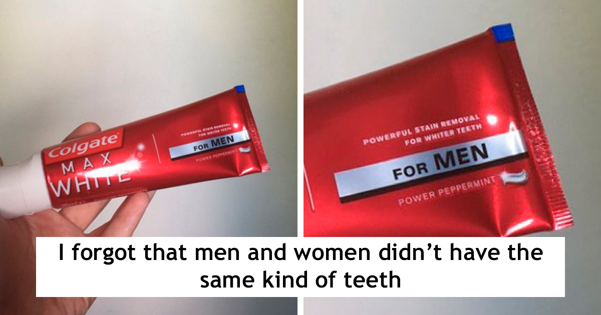
Some examples of male beauty products (as if we have different skin / teeth or hair?)


Look Trendy With Fantastic New Hair Products for Men ...


I want to design something 'uber-masculine' so as to mock this trend of lowering the price and just sticking a black label saying for men on products, something that oozes with testosterone.

Thursday, 26 April 2018

OUGD501 Essay: How does screen based Media Effect Mental Health


Chat Room App Final/ Walk Through and animation.


The 'Calm Down' page wast to be animated to to the tempo of someone breathing, exercising calming breathing techniques however XD won't let you add in animations;


Had I had more time I would've liked to have also animated the front page logo (loading page) as well as making this animation for the Calm Down page smoother, more reminiscent of somebody slowly breathing to go in time with the breathing exercises which can be played hitting the play button underneath.


Wednesday, 25 April 2018

COP III: Initial Draft Proposal & Brief

COP III
  • 40 credits (double the normal amount) 
  • Consider collaboration for practical if you require a skill set you are unfamiliar with as there isn't time to teach yourself a new skill.
  • read 5 books/ articles over summer related to context or theoretical approaches 
  • We will be assigned a supervisor dependant on topic we choose
  • Don't use too much theory, use it as a backbone for your essay
  • There are no off the shelf ways of structuring an essay 
  • will be different to other courses, don't take advice from someone on another course!
Theoretical Approaches


COP III Proposal:


Brief:

Masculine Magazine

Produce a publication of 'all things manly', picking out things I identify through research as being typically masculine and mock this, by producing an over-exaggerated satiric piece of design, considerate of colours, shapes and typography.

Background

Look into 'masculine' branding, design for example Gillette razors. Tackle the aesthetic of Feminist zines which often challenge the notion of 'femininity'.

Deliverables

Publication: most likely magazine format

Mandatory requirements 

Emphasise through design belief that 'masculinity' is a weakness in some way, a social construct that often disables men to express themselves, which can be detrimental. Focus on type, colour and shape.

Monday, 23 April 2018

COP II Practical Outcome: Further Research

"Disclosing intimate details of one's life while face-to-face with someone often carries a fear of the the possibility of judgement." 


Stephen Goss, Kate Anthony, LoriAnne Sykes Stretch, DeeAnna Merz Nagel, 2016. Technology In Mental Health- Applications In Practice, Supervision and Training. Springfield: Charles C Thomas Publishing 


Further Research


Ginger.io can be used to track people's mobile phone usage, in basic terms if people are sending less texts, interacting using their phone less this usually indicates a dip in mood, which is possibly detrimental to certain patients, this could furthermore work in a university setting as parents can send 'hugs' and so forth. The app links the patient with a therapist who is informed on inactivity, at which point they can choose to intervene. My argument for this would be that it's an invasion of privacy, a lack of messages could simply be an indication to the patient busy working, sleeping and so on, times when a message from a therapist would be unwelcome and may even put the patient in the bad mood they're initially presumed to be in.


Saturday, 14 April 2018

Chat Room App Initial Designs

Current 'Chat Room' branding I have done so far for my OUGD505 Studio Brief (which is the physical Chat Room situated in student welfare offices):


The logo being this head with a tentacle emerging from the mouth, will be used for the Chat Room app I'm developing for this module. This was chosen thanks to research I did on representing mental health visually, my personal metaphorical representation has always been tentacles as my councillor years ago asked me to visualise emotions. These projects furthermore extend from a first year project, using tentacles as way-finding arrows.

I plan to have the whole app in teal, every page background as I've found from feedback this works well as a colour that will aid calming people, it's also similar to the blues used consistently throughout mental health literature, but an updated version which is essential as I want to move away from the old aesthetic that carries so much stigma.


Is more consistent in terms of design to keep all the visuals in white as they are on the digital poster.

Upon opening the app, I want the loading page before you get to the homepage that you have to click through to be animated. 

It will use a slight variation on the current logo that I'm using but will still be uniformed in terms of design, so it's recognisable and will strengthen visual identity of brand.


Second page- Information 


I thought it best to have a second welcoming page to offer explanation as to what the app is and who it's for. This app will only be advertised on individual universities notice boards and online forums/ intranet, making the only accessible audience, students. I thought about having an additional page where students log into their own intranet via the app which enables access and puts them through to volunteers at their uni, however as this process in anonymous anyway it doesn't particularly matter all it would be doing was adding another barrier up to people seeking immediate help, further increasing stress levels as filling out information requires concentration which may not be possible in stressful situations, counteracting the purpose of the app.


This page offer information about the app and the physical chat room.

Initially in white the text in Loopy font really isn't very legible as the lines are too thin, however in black this issue is less so. It still looks uniformed as I plant to use this font throughout all the headings, as it is used as the key font on my digital poster.


I plan to animate this, unveiling the text as if it's being typed, in-keeping with the visuals  of a chat room dialect.